Meal planner app for nutrition-savvy foodies

Project
MyFoodData (MFD) is a web-based platform helping nutrition-savvy meal planners and cooks tailor their meals toward their nutritional needs. For this project, I redesigned the meal planner dashboard, which focuses on making it easier to plan, view and share meal plans and analyze nutrition information.
Make the MFD dashboard more useful for users
Increase number of food entries by 200%
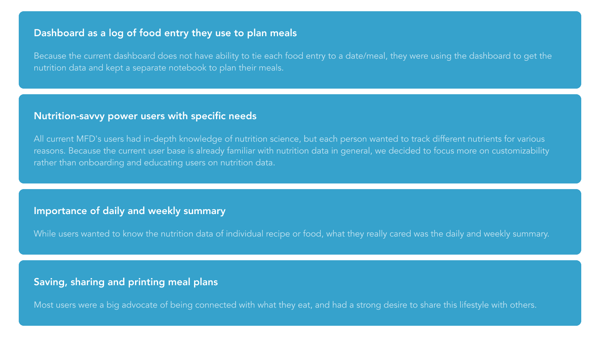
MFD’s first dashboard was a simple list of saved foods, compiling nutrition data from various sources. While it presented detailed nutrition information, it didn’t unify the content to address specific user needs. Through user discussions, key questions emerged:
Who are MFD's target users?
What goals do they have that MFD is uniquely positioned to help with?
How might we present nutrition data in a way that best fits users' goals?
How might we allow customizability in a simple and intuitive design?
Role
Product designer
Date
June - August 2021
Deliverables
Strategy
UX research
Competitor analysis
Persona development
Wireframes
High-fidelity design
COMPETITIVE ANALYSIS
The food and health industry is highly competitive, with weight loss being a common user goal. However, each app takes a slightly different approach. We analyzed 35 apps and 8 websites to understand their value propositions and features.

USER INTERVIEWS
I conducted three user interviews to explore current behaviors. These interviews refined our personas and confirmed that the next dashboard iteration should be a data-driven meal planner with easy save, share, and print features.
USER PERSONAS
We decided to focus on the planners and cooks for the following reasons: My client is passionate about serving the underserved planner and cook category rather than attempting to create something in an already bulging weight-loss segmentWith MFD being web-based, it lends itself much more naturally to use flows that aren’t as focused on mobile-based food intake tracking.

Features & Goals
Taking insights from all user studies, we defined to work on the following features.
USER FLOW
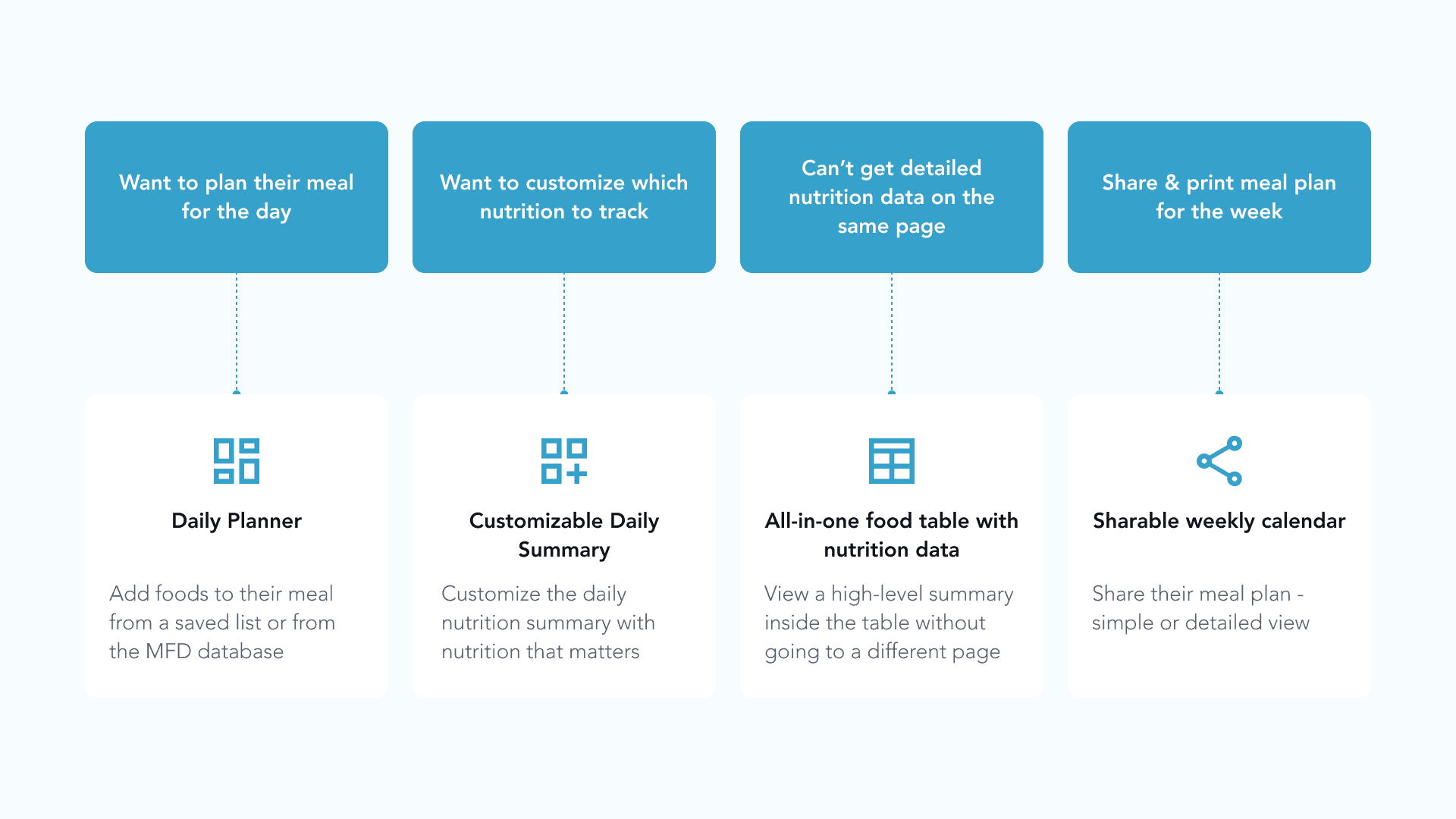
Our research led to three main objectives: 1) allow users to add foods, recipes, or meals to a daily planner to track nutrient goals, 2) enable saving frequently used items, and 3) provide a weekly meal plan with target nutrient insights. We then mapped key user actions for each page and defined essential links between them.

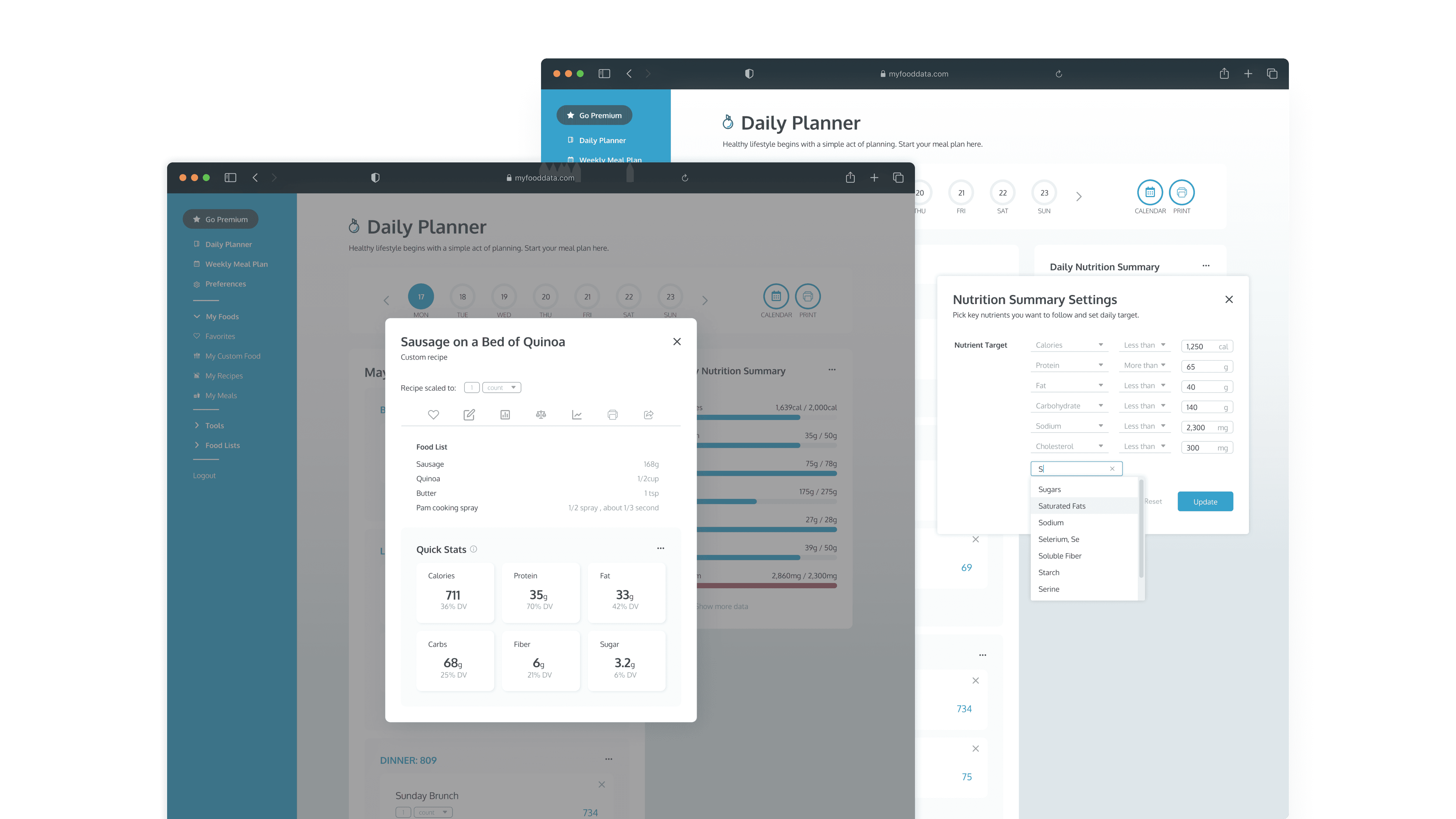
DAILY PLANNER
Challenge: Users want to plan meals using nutritional information directly in the dashboard.
Solution: Embedded food entry modal After selecting a date and meal on the Daily Planner page, users then add foods to their meal from a saved list (favorites, custom foods, recipes or meals) or by searching the MFD database. As foods are added to the meal planner, the daily nutrition summary is automatically updated.
CUSTOMIZABLE DAILY SUMMARY
Challenge: Users want to track specific nutrients important to them.
Solution: Customizable Daily Nutrition Summary component Being able to customize the daily nutrition summary was an important feature to include as users cared about different nutrient targets. The initial values are set to the recommended amount for a daily diet of 2,000 calories, but users can personalize the target amount and the nutrients they are interested in. We decided to limit the functionality there, but future work should consider including: 1) educational onboarding processes to help teach users about nutrient targets, and 2) alert messages for meals that are providing too much of a specific nutrient and other unhealthy edge cases.
FOOD CARDS
Challenge: The current view does not distinguish between food, recipes, and meals -- making it difficult for users to understand the different terms. In addition, each card showed only ingredients without providing insight into nutrition.
Solution: Food specific cards The new design has three different food cards -- food, recipe, and meal -- that show progressively more information, depending on the type. In addition, we provided similar information to the Daily Planner and Nutritional Summary to maintain a consistent experience and provide nutrition data wherever it is necessary.
Saved list of foods
Challenge: The current dashboard only gives the ingredient list per individual food card, and users would have to go to another page to get more detailed analysis on its nutrition data.
Solution: All-in-one food table with detailed nutrition data Instead of taking users to a different page to view detailed information, users can view a high-level summary on the table view; for example, once a food, recipe, or meal is clicked on, a window expands to show more detailed nutrition data.
WEEKLY PLAN
Challenge: Users wanted to plan their meals on a weekly basis to track specific, relevant nutrients Solution: Weekly calendar with detailed information toggle The Weekly Plan page is designed for users who want to print or share their meal plan. Users can toggle between the simple and detailed view to see a breakdown of their nutrition daily and per meal.
Next Steps
The MVP was released, and the feedback we got from existing power users has been extremely positive. By providing a much clearer purpose for this dashboard, we saw an 345% increase in number of food entries, 10% in page views, and 85% increase in sign ups.
Now that this large product iteration has launched and shown to be successful, there are a few different directions that we’ve started to investigate to build upon this success. Our next steps include:
Thinking through mobile strategy
Redesigning other single page tools optimized for SEO (e.g. recipe nutrition calculator) to match the new look and integrate all the tools to lead to sign up
Creating a profile page to allow users to enter in their personal data
Designing for different use case (e.g. nutritionists creating meal plans for their clients)