A context-based language learning app for vocabulary acquisition

Project
Idiom is a language learning app that helps users learn new words by immersing them in real-world content, like news and websites they already visit. It lets users quickly look up and save difficult words to review later.
We aimed to improve user retention for both new and existing users by tackling the following challenges:
1. For new users – Enhancing feature discovery and onboarding
New users struggle to find and explore different features, leading to limited engagement.
The absence of empty states creates confusion and increases churn.
2. For existing users – Expanding vocabulary review and introducing strategic reminders
User journeys are mostly passive, focused on vocabulary exposure rather than active learning.
The app relies solely on intrinsic motivation and lacks external reminders to encourage continued engagement.
A redesign of the onboarding flow and tutorials, and new designs for the Highlights tab, incorporating insights from user interviews
Role
Product designer
Date
2021
Deliverables
UX research
Persona development
Wireframe
High-fidelity design
USER INTERVIEWS
I interacted with 8 app users, conducting 3 interviews with power users and usability tests with 5 new users. These insights confirmed the main drop-off points I had previously identified through user activity analysis.
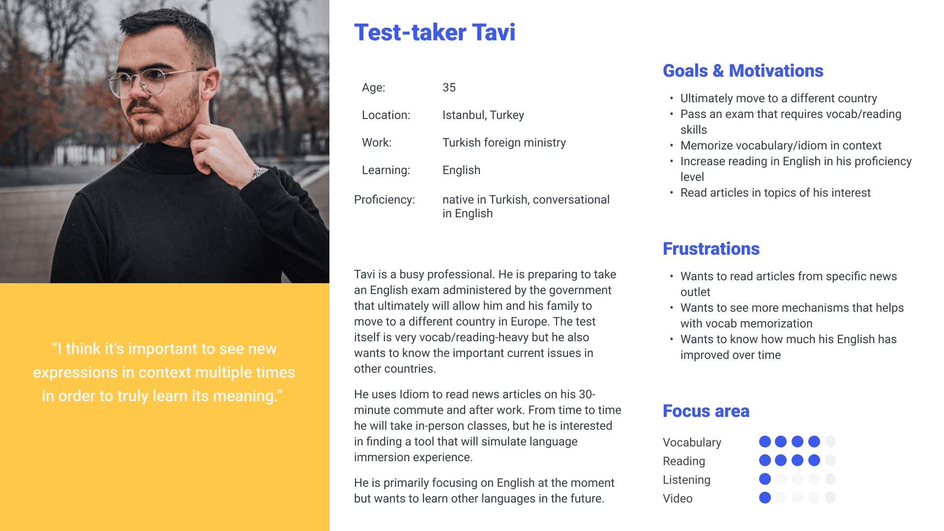
USER PERSONA
Although both the client and I have familiarity in the language learning space, we brought different understandings of user profiles. Building the following personas based on user behavior and interviews was very beneficial to clarify precisely the user needs to target.
USER JOURNEY
Mapping the user journey and overlaying the biggest drop offs helped identity the biggest leverage points for action triggers. These triggers were meant to help users continue their user journey and get deeper value from the app. The new features have been added below in yellow.

WELCOME SCREEN
Challenge: During user interviews, users who don't immediately open the app post installation forget exactly what the app does and how it is useful.
Solution: A skippable welcome screen that explains the key features of the product both serves as a good reminder as well as an opportunity to create an additional sense of excitement before embarking on the user journey.
INTERACTIVE ONBOARDING
Challenge: The original interactive onboarding had high engagement rates, but did not introduce users to multiple compelling features - such as the audio reader or how to follow a content channel - that would be very useful to surface.Solution: Using progressive disclosure to extend the interactive tutorial, users can learn the value of each feature one step at a time. Different in-app user actions triggered the start of the next step of the onboarding tutorial. For example, opening the first news article, or looking up any word for the first time, both triggered different steps of the tutorial.
First article open
First word lookup
EMPTY STATES DESIGN
Challenge: A large point of confusion for users were the blank screens as a result of missing empty states in custom feeds when they had not yet followed any channels.
Solution: The custom feed's empty state now includes a button that directs users to discover popular channels. In this case, we repurposed the existing 'search' page by including a list of trending channels and marking the 'Follow' button more explicitly.
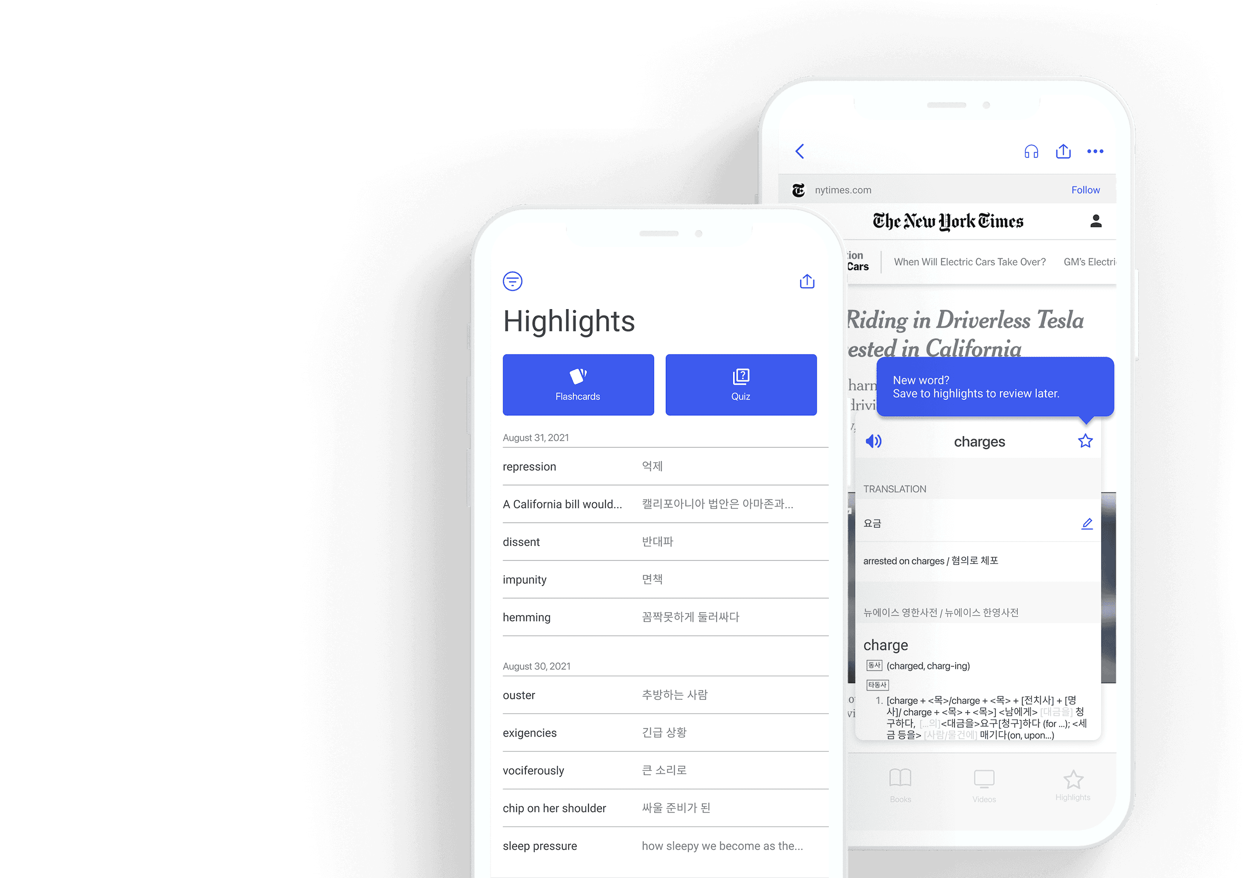
HIGHLIGHTS - REIMAGINED
Challenge: The current Highlights tab displays an information dense list of previously highlighted words. Lacking in interactive components, this page had very low engagement and retention, especially for what is one of the marquee features of the product.
Solution: Moving from <sentence view> to <definition view>
Since users are looking up words in the target language they are learning, entire sentences presents an overload of information. The new design evokes the familiar interface of a vocabulary notebook, displaying highlighted words and their definitions. Since language is tricky and words have multiple denotations, users can also edit the definition to help them better memorize the word.
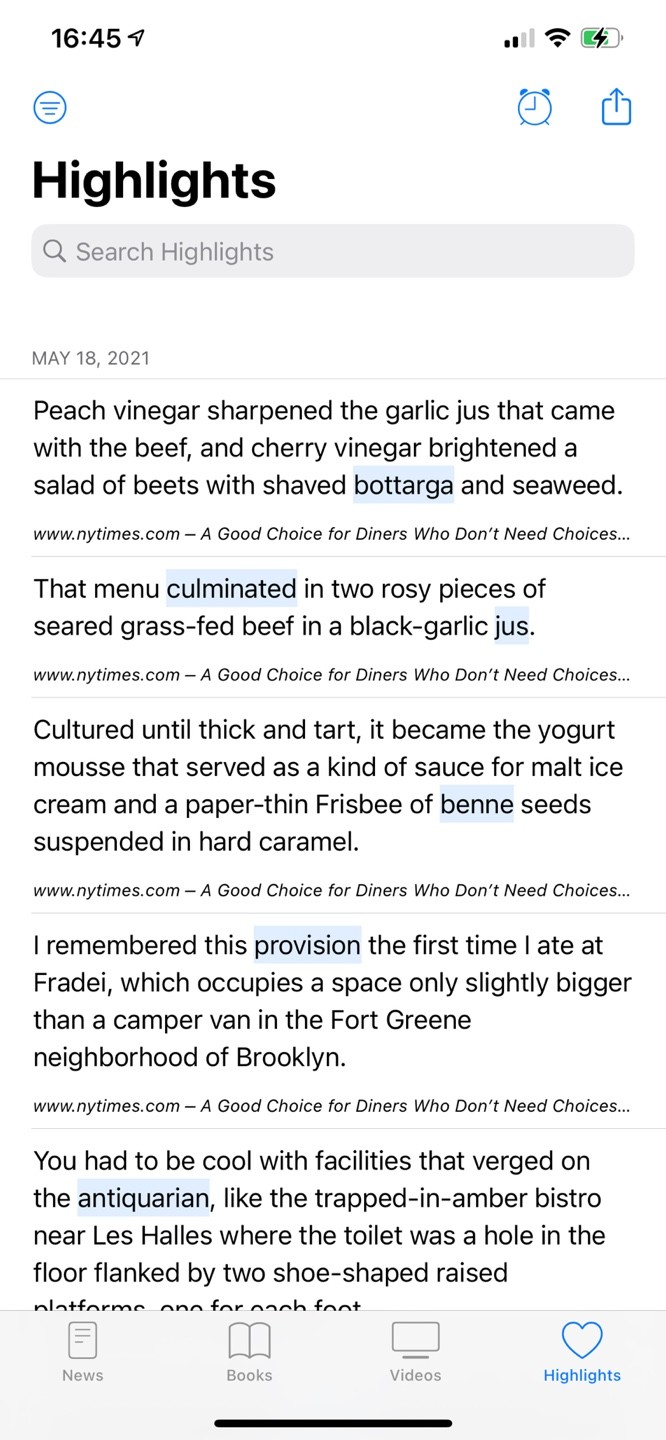
Sentence view (old)
Definition view (new)
HIGHLIGHTS - FLASH Cards
Challenge: Reviews currently present in the Highlights page did not satisfy either new or power users. The quiz like format required a high level of engagement, which drove away new users looking for casual review mechanisms, while also being of low value for power users interested specifically in SRS techniques for language learning.
Solution: Automatic flashcards as low-activation review option
Instead of developing a high-effort feature like SRS - the adoption of which is unknown until further testing can be made - we decided to focus on the introduction of flashcards that users review with minimal effort. To encourage usage and vocabulary retainment, the previous day's highlighted words are automatically prompted for review when the user opens the Highlights tab for the first time each day.

NOTIFICATIONS - REIMAGINED
Challenge: The app did not utilize any push notification mechanisms to remind users to come back.
Solution: Targeted notifications with a specific value proposition
To build trust with our users, we hold off on asking for the permission to send notifications until we have a compelling reason for users that are performing reviews. Specifically, they will only get this request at the end of the first flashcard review. The notification subsequently directs users to review their last 10 highlighted words.
This represents a small subset of potential notifications, but we have elected to tread very lightly here, starting from the philosophy of 'why send this notification', rather than 'why not'.

Next Steps
This design presents a large step forward for the usability and value proposition of the app. As the design is rolled out, validation is being performed to confirm increases in desired metrics.
To move forward with the next version of this app, there are a few different aspects that can be worked on.
From the product side:
User interactions rewarding the taking of desired actions (e.g. completing a review leading to confetti)
Further developing flashcard & review features to be customizable
Testing different triggers to send notifications (e.g. content recommendation, scheduled reminders)
Designing page to track progress & feel good about it
On the business side:
Re-thinking through which features to include in the premium plan and communicating its benefits in a more effective way
Designing refer program to encourage more organic growth