Challenges with Multi-Brand Design System
Base UI all started with a practical goal: streamline how each franchise team built their marketing sites. The original Shared Tech team created a component library that could be themed and assembled quickly, helping teams ship faster. Leadership saw the results and set a bigger challenge: evolve this shared library into a full-fledged design system—one that could support not only marketing sites, but also the broader Battle.net ecosystem. With the looming Xbox acquisition, Base UI needed to scale—and fast.
Initially, each franchise had its own theme, while Battle.net verticals (like Shop, Account, and Desktop App) built bespoke components. The result? Duplicated work, inconsistent UI, and mounting design debt. Enter the new Shared Tech team with a mission: build one design system to unify it all.
This post dives into the key challenges we faced and the approach we took to build a system flexible enough for diverse brands, yet consistent enough to feel cohesive.
Brand Differentiation vs. Design Consistency
One of our biggest balancing acts was preserving brand personality without breaking shared structure. Battle.net leans compact and functional, while game franchises often aim for cinematic, immersive experiences.
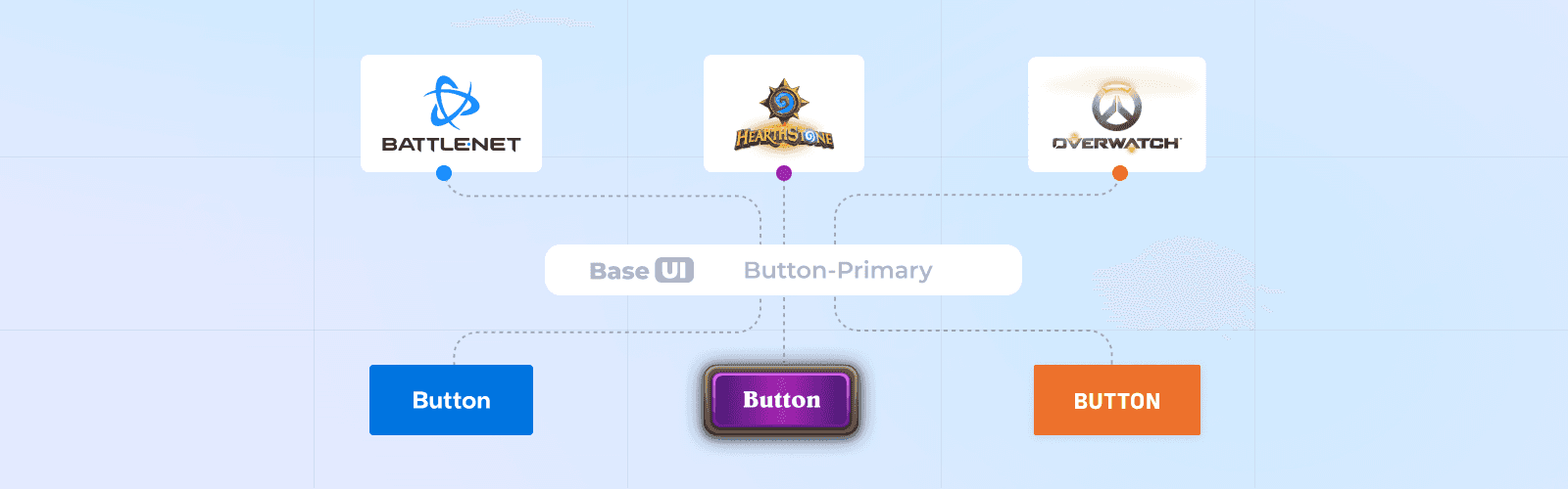
One Token System to Rule Them All
To reconcile these needs, we built a three-tier token architecture—global, semantic, and component levels. Each team could theme tokens for color, spacing, and typography without creating custom components. A card with 8px padding on Battle.net might scale to 16px on a game site with zero redesign effort.
When Tokens Aren’t Enough
Tokens handled most brand expression challenges—but not all. Complex components like banners (with logos, headings, CTAs, and background images) revealed the limitations:
Responsive Behavior: What looked great for one brand’s layout often didn’t scale well to another.
Controlled Flexibility: Teams wanted fine control—logo size, text wrapping, content width.
Content Variability: A great layout can still break if content is too long or inconsistent.
How We Tackled It
We interviewed teams to expose only the most critical, customizable variables.
We refined spacing tokens to better serve outlier cases—like introducing an “extra large” button size for Battle.net.
We partnered closely with content teams and wrote clear usage guidelines—though true collaboration remains a work in progress.
From Templates to Flexible Frameworks
Early Base UI relied on rigid templates (e.g., carousel sections) designed for marketing. But these posed two issues:
They were too opinionated—teams couldn’t reuse or modify them easily.
Shared Tech became a bottleneck, constantly asked to tweak these “one-off” blocks.
Slot-Based Framework
We ditched rigid sections in favor of modular layout components with configurable slots. Instead of a fixed carousel block, teams could define rows and columns and drop in whatever components they needed. It was flexible, composable, and cut our maintenance overhead dramatically.
Figma Library & Documentation
Storybook had full token theming, but designers weren’t adopting it. Why? It defaulted to Base UI’s theme and wasn’t where they worked day-to-day.
So we dedicated a sprint to overhauling our Figma library. We incorporated theme switching via Tokens Studio and gave Battle.net its own dedicated library.
Tokens Studio managed the GitHub pipeline well, but came with bugs and a learning curve that made onboarding bumpy. Spacing tokens in particular were tricky—Figma variables didn’t fully support our needs, and Tokens Studio filled the gap (less elegantly than we hoped).
We ran tutorials, created walkthrough videos, and wrote thorough documentation. Adoption grew, but it’s still a work in progress. We’re optimistic that improvements to Figma variables will reduce reliance on external tools and make theming smoother for everyone.
Final Thoughts
Base UI started as a tactical tool for marketing—but quickly became the foundation for unifying Blizzard’s digital presence. To scale it, we needed more than components—we needed shared principles, adaptable frameworks, and buy-in from designers across teams.
By investing in tokens, composable layouts, and cross-functional governance, we built a system that’s structured enough to drive consistency, yet flexible enough to embrace brand identity. And most importantly, we showed teams that a design system isn’t a constraint—it’s a launchpad.
In a fast-evolving platform like Battle.net, that mindset shift is the real win.