Improving product detail page on Battle.Net shop


Project
The company’s focus on bringing in new users for the Diablo 4 launch has highlighted the need to redesign the product detail page. The current version lacks content, which may result in a subpar experience for new players looking for game information. However, many potential buyers are longtime fans already familiar with the franchise. The challenge is to balance both audiences—providing helpful details for newcomers while allowing returning players to quickly find what they need and make a purchase with ease.
The product detail pages need to cater toward various user types and their goals.
For new players: How might we help new users to get excited about the game without being overwhelmed with the depth of information?
For existing Blizzard players: How might we offer relevant information that they are seeking while also providing easy access to purchase the product?
Role
Senior product designer
Date
2023
Deliverables
Strategy
UX research
Usability testing
UX design
Wireframes
High-fidelity design
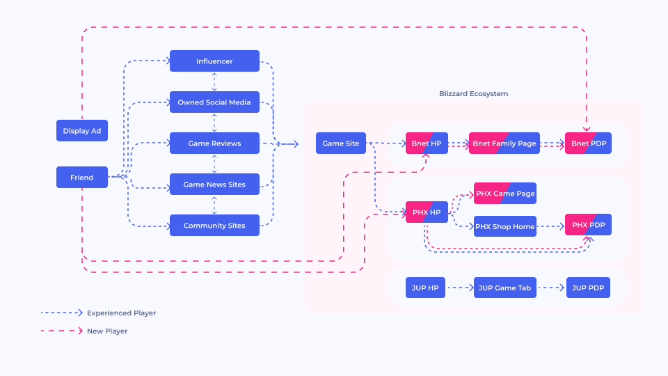
Understanding User Journey
Players gather information from various online sources, so it was crucial to evaluate their level of knowledge when they reached the Game Tab of the desktop app. This mapping of the user journey before acquisition served as a solid foundation for understanding the challenges in improving the Product Detail Page.
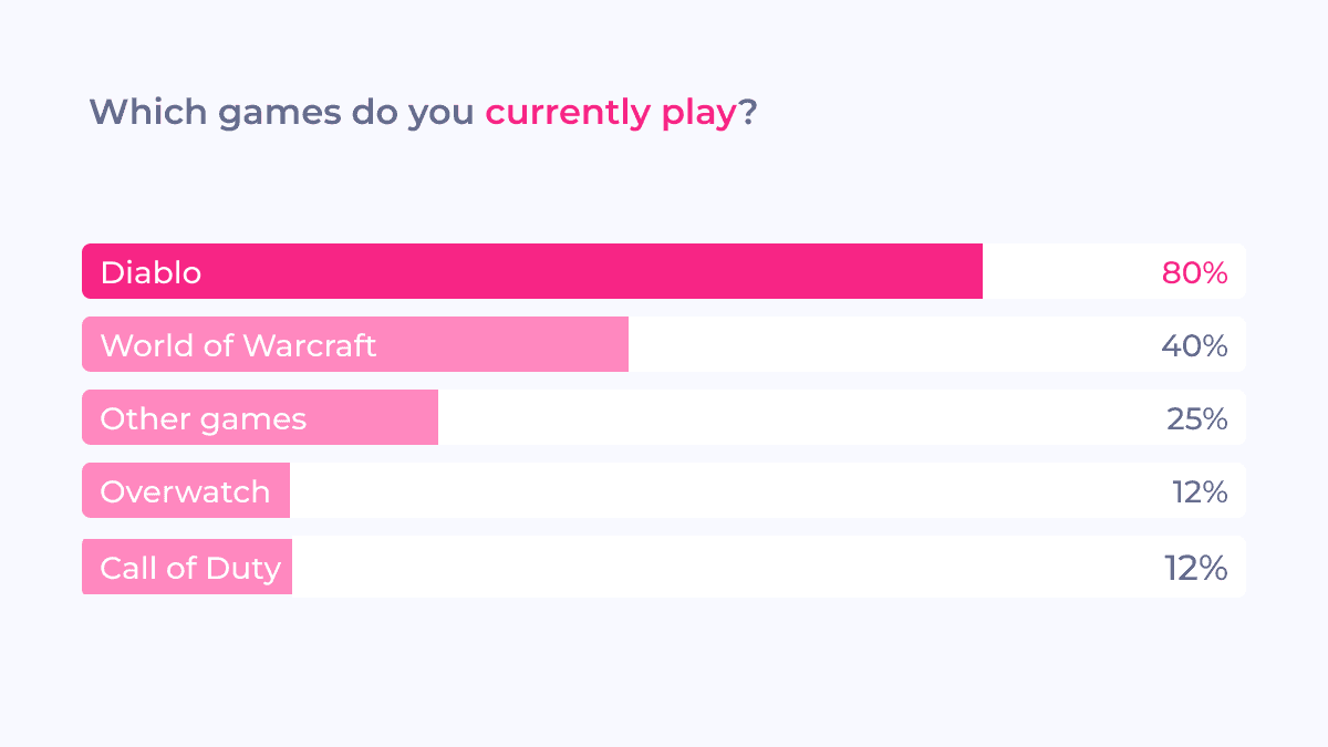
User survey
We sent out a quick user survey to ~20k users who visited the current Diablo IV product detail page to understand the content they want to see on a product detail page for new games. From ~1k responses we collected, we learned the following insights: Read more about learning insights from the survey on gamer purchase journey.
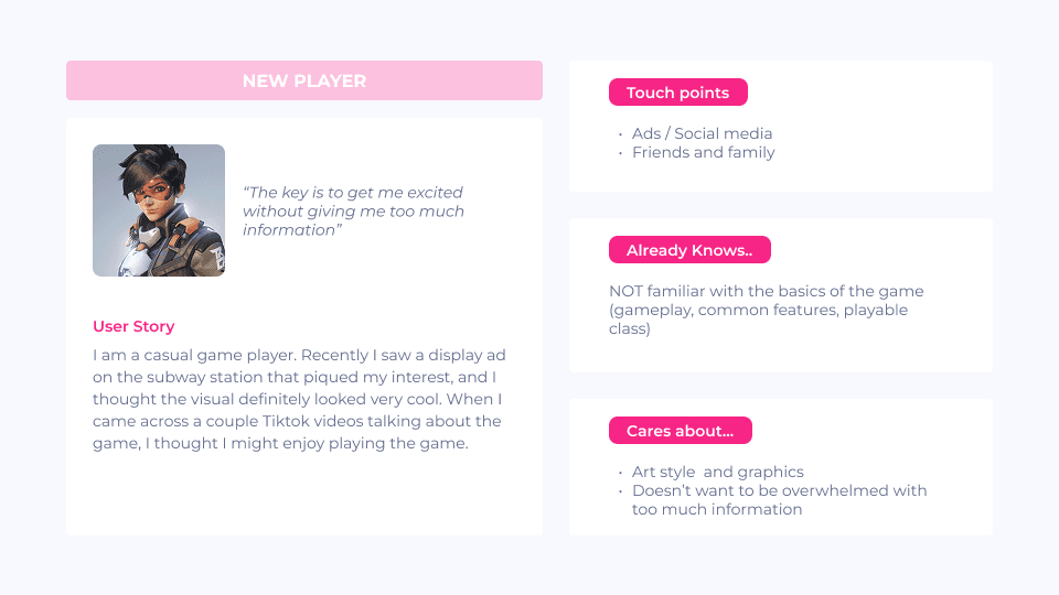
User persona
Based on the results of the survey and acquisition flow mapping, we created three distinct persona types to guide our design strategy.
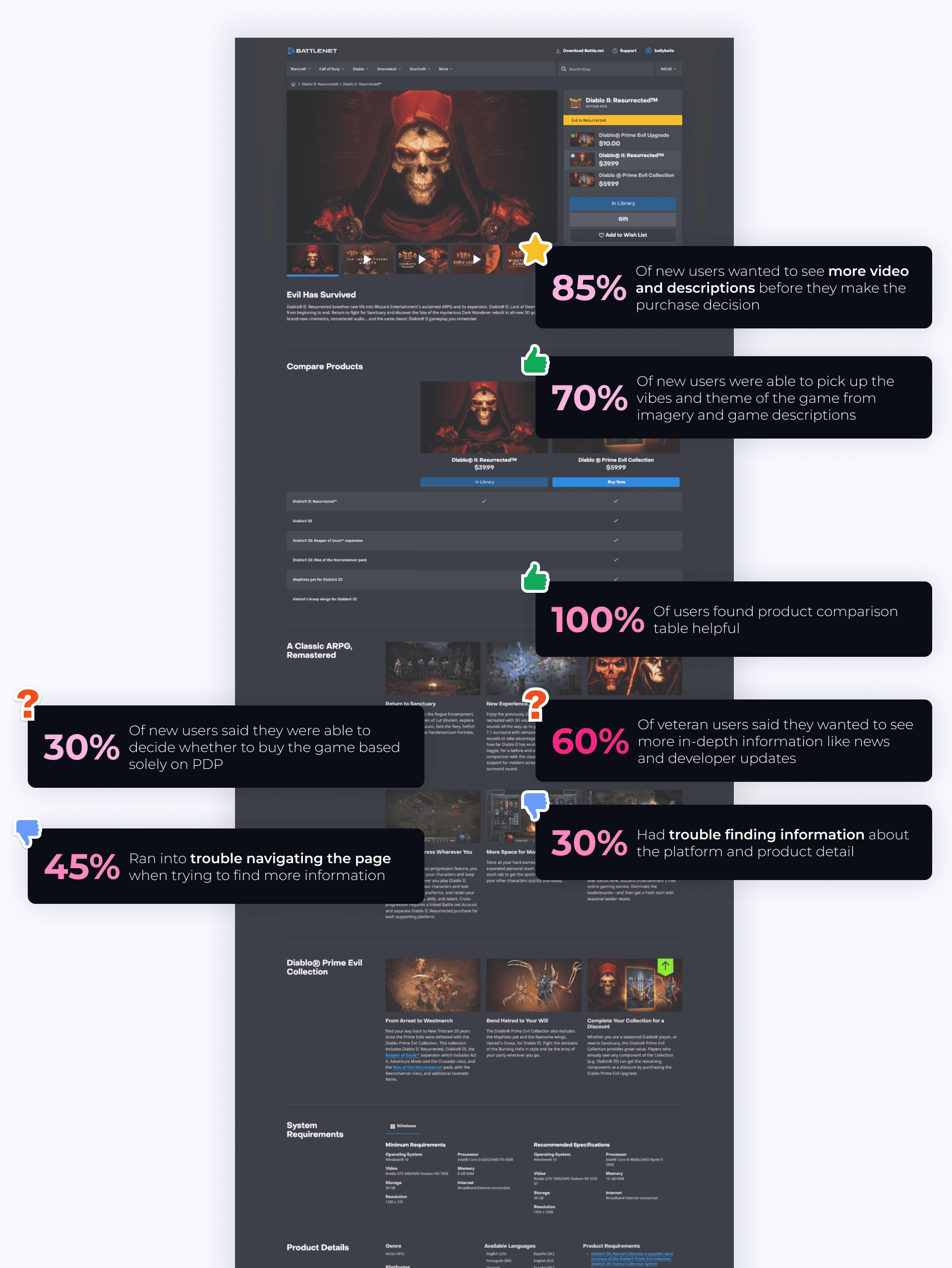
Usabiliity testing
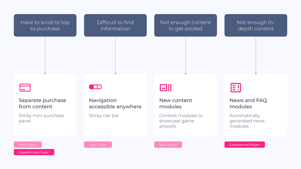
Since we already had a product detail page, our goal was to fix user pain points while designing the new version. For usability testing, we asked 10 Diablo and non-Diablo players to review the Diablo II Resurrected product page. We focused on:
Checking if the page had enough content to build purchase confidence
Testing how easy it was to find information
Identifying any missing content users expected to see
Problems & goals
Assuming that new and experienced players want to see different information, how do we strike a balance between generating excitement about the game and avoiding overwhelming them with too much information?
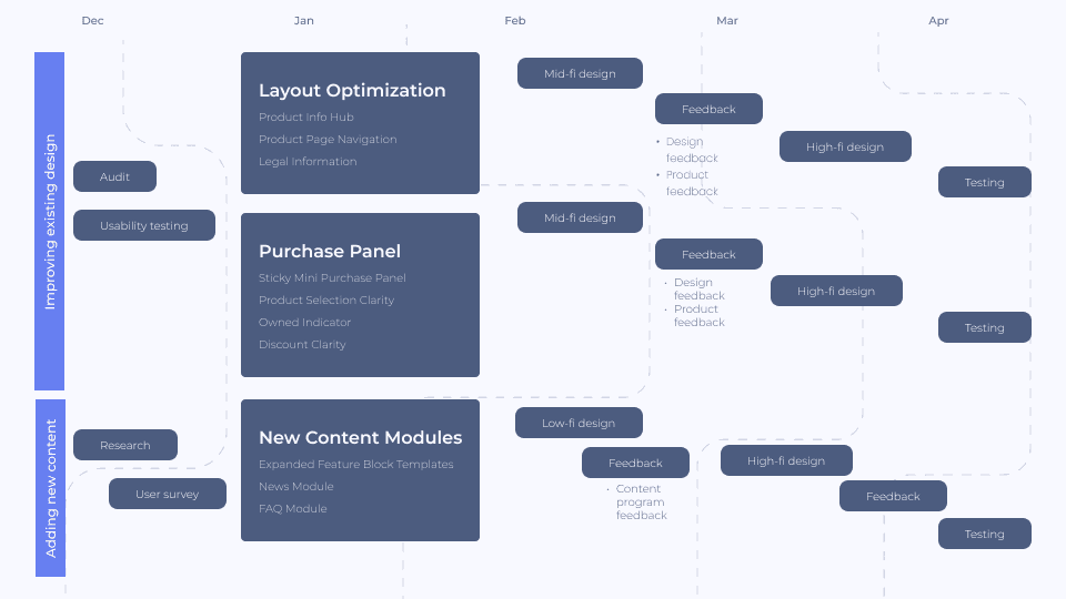
Process
To handle the project’s complexity with multiple components to address, we took a modular approach. After identifying key issues and defining which features needed improvement, we prioritized their implementation for a more structured and efficient workflow.
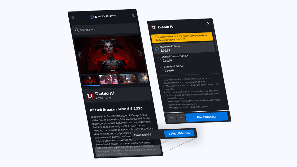
Sticky purchase panel
By creating separate layers for content and purchase, the layout now caters to both user groups. New players can explore the game without being distracted by purchase details, while veteran players can quickly access the purchase panel from any point on the page.
Stress-testing the component
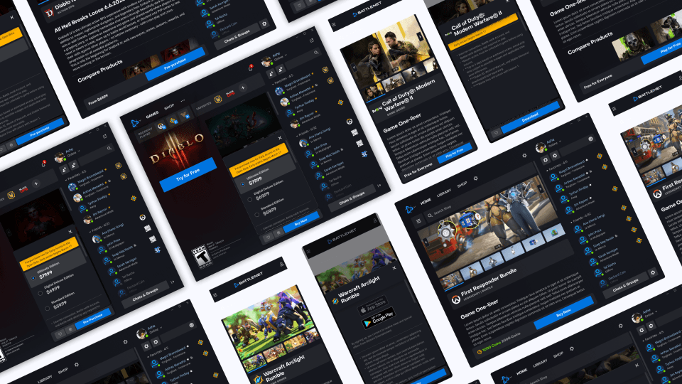
After establishing the fundamental user flow, I conducted testing on 8 different product types on 4 different platforms to ensure that the component could handle multiple calls-to-action and types of purchases.
Sticky nav bar
In usability testing, we found that new users struggled to find the information they needed because the page had too much content. To fix this, we added a sticky navigation bar to make it easier for them to move around the page.
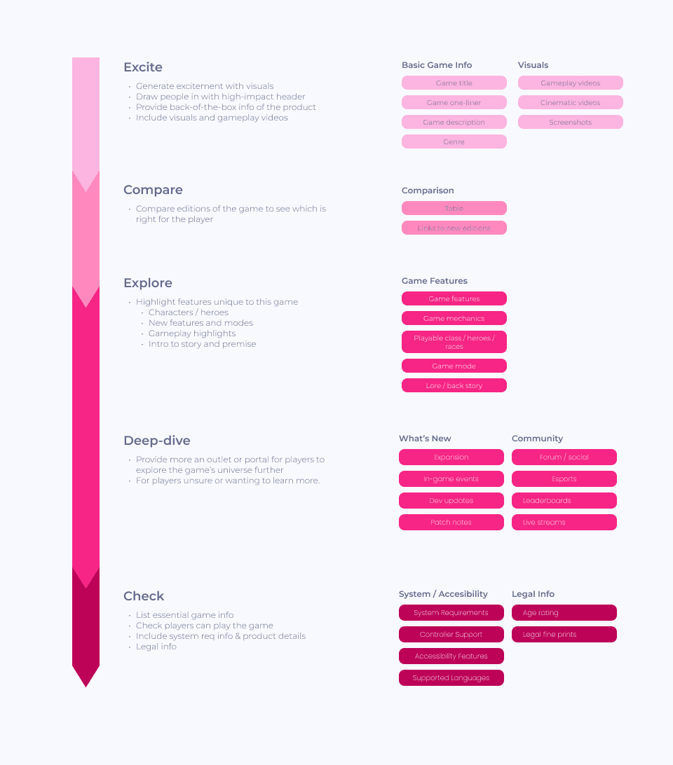
Page structure
We developed a page strategy for organizing different types of content on the game landing pages to be aligned with company’s goal to focused on acquiring new players.
Stakeholders in content management
A different team will be managing content on the Shop. We conducted user interview with the content team to identify possible content we can put on the Product Detail Pages.
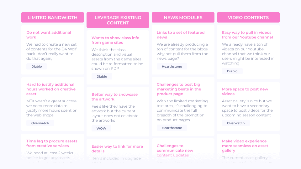
New content modules
Our initial goal was to utilize the existing content on the product detail page. To achieve this, we created a new template that prioritized the visual assets over text, while treating text as supplementary information.

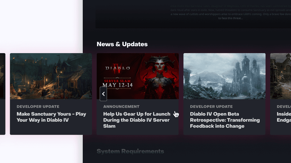
News module
Our initial goal was to utilize the existing content on the product detail page. To achieve this, we created a new template that prioritized the visual assets over text, while treating text as supplementary information.
Next Steps
We're adopting a modular and iterative approach to implement project components. While some are being developed, others are awaiting resolution of stakeholder disagreements. Next steps include:
Implementing sticky mini purchase panel across all platforms including the web shop after figuring out what to do with the secondary custom buttons
Consolidating design patterns across various platforms including the mobile app
Improving navigational challenges we've observed during usability testing
Designing new modules to accommodate different type of content including News and FAQ