base ui: Building a multi-brand design system


Project
I led the team responsible for developing a multi-brand design system for Battle.net and other Blizzard brands. This work involved unifying multiple digital brand guidelines into a cohesive design system, developing tokens system, conducting comprehensive product audits, refining component designs, and establishing design and communication workflow across 6 different teams.
process
From the inception of the team, I partnered closely with engineering and product leads to build the design system and drive its adoption across teams. I worked with design leads from other groups to spot opportunities for new components and refinements, enhancing the system’s adaptability for various needs. I also supported the rollout of new themes to enable the launch of Blizzard’s latest game websites.
Role
Design lead, Design Systems
Date
2024 - 25
Deliverables
Tokens taxonomy
Design system documentation in:
StoryBook
Documentation site
Figma library with theme switcher


Design Tokens

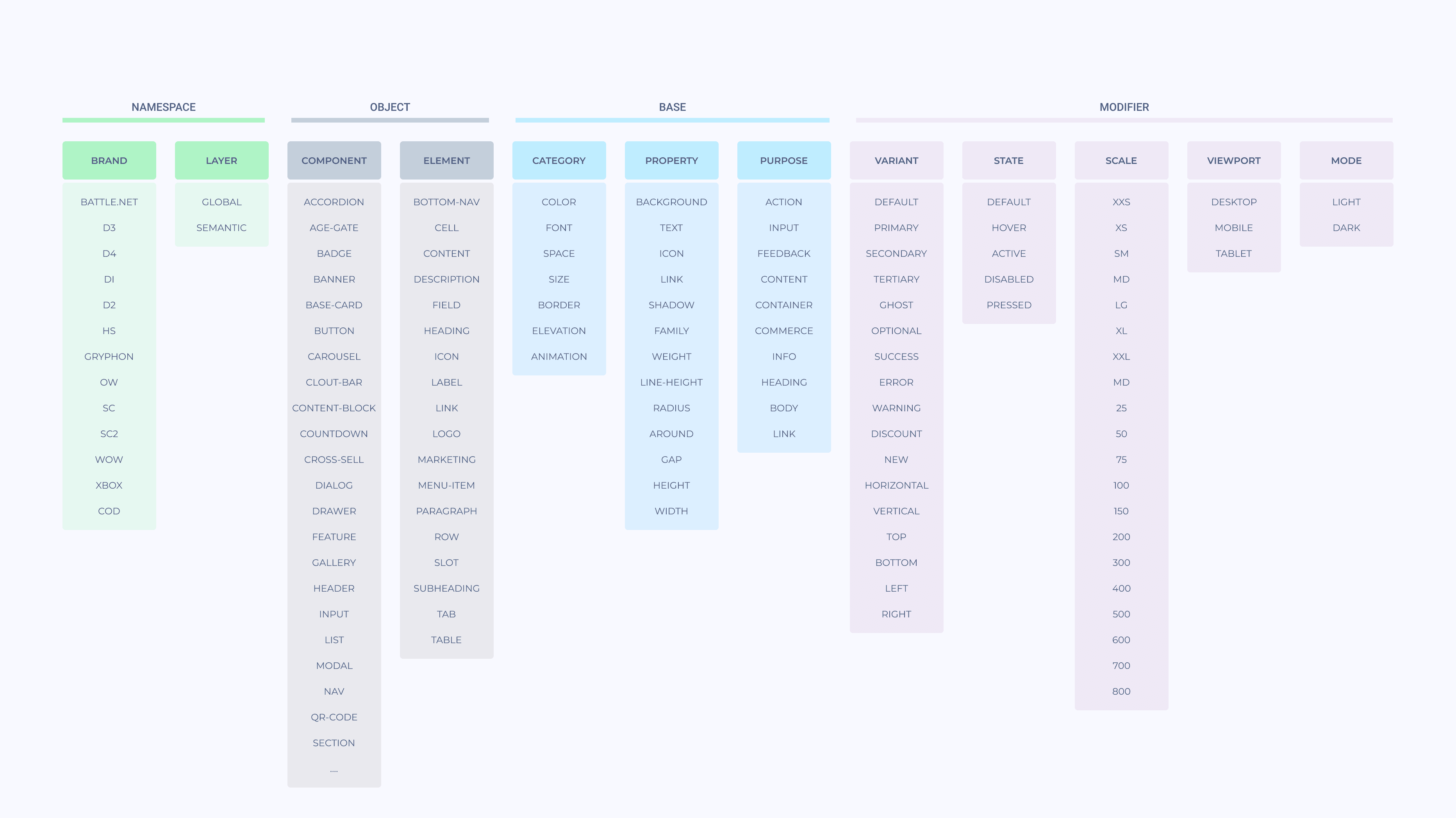
Base Tokens
The core focus of this project was to create a unified token structure that enabled seamless theme switching across multiple brands. We developed a token taxonomy system and integrated it into all existing components within the legacy library.

Component Library
Component library in Figma
We updated all components with token schemes to ensure they reflect every brand style. This was done using Figma Variables and the Tokens Studio plugin.
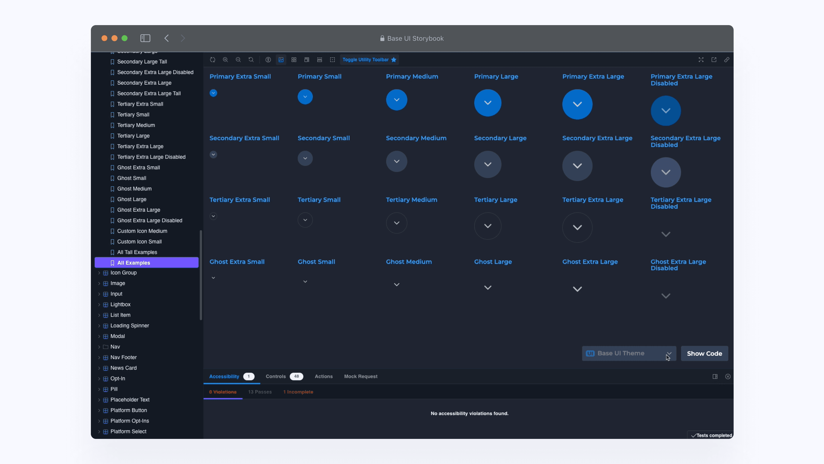
Theme switcher in Figma & Code
We enabled theme switching in both Storybook and Figma, allowing teams to visualize all components in their brand’s style.

Flexible components
Instead of maintaining numerous similar components designed for specific purposes, we decoupled purpose from layout and introduced a flexible container that remains unopinionated about the component’s use case.
Documentation
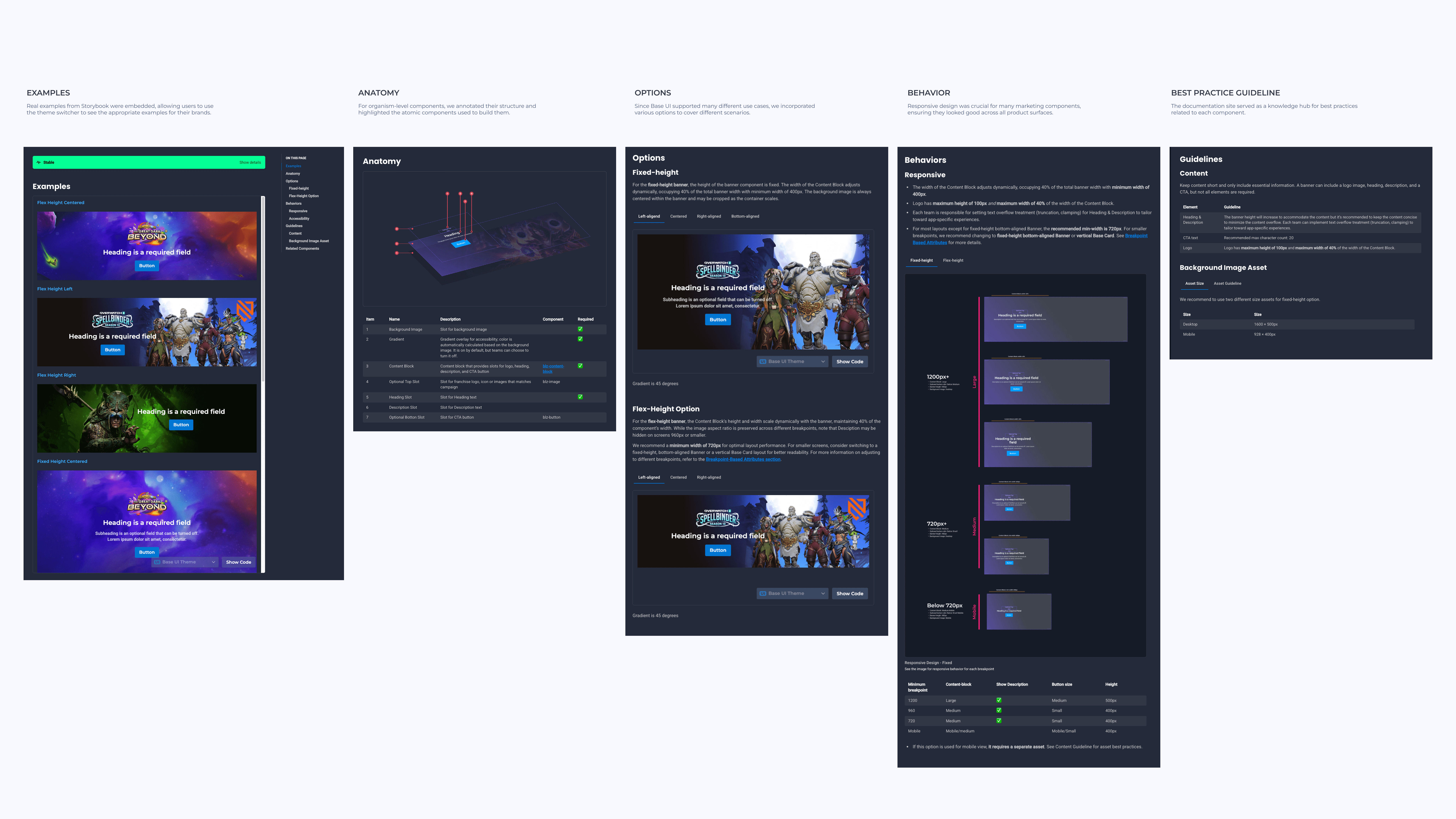
Documentation
We utilized Supernova to build a comprehensive documentation, providing detailed information on each component, including anatomy, options, behavior, responsiveness, tokens, and best practices.

Implementation
Shared strategy for cohesive design
One of the biggest outcomes of this project was bridging the gaps between teams, enabling discussions around lingering style discrepancies. Each week, a committee of designers from different teams identified inconsistencies and aligned on visual guidelines, while our team facilitated the federated governance model to maintain component design quality.

Tracking design in JIRA
Trakcing projects became a larger focus when designers are designing for Base UI since it involved multiple people from different teams to coordinate. I developed a workflow and templates to make it easier for designers to track and size their design workflow.
Next Steps
Now that Base UI is fully built and teams are aligned on its adoption, the focus shifts to onboarding, ongoing education, and measuring success. These steps will help fully integrate the system into workflows, ensure continuous improvement, and track its impact.
Support onboarding for all teams to start using Base UI Figma components
While some designers have started using Base UI, full adoption requires a structured onboarding process to help all teams transition smoothly. Beyond guidelines, tutorials, and live training sessions, we discussed running user studies and usability testing to identify pain points in using the Base UI library.Continuous education of the intricacies of Base UI
Adoption goes beyond onboarding—it’s about helping teams understand Base UI’s principles, constraints, and best practices. Without this knowledge, designers may modify components incorrectly, and developers may build inconsistent implementations. A key focus will be educating designers on tokens, enabling them to self-serve with existing tokens and create new ones when needed.Implement ways to measure success & impact
To justify continued investment in Base UI and ensure it’s actually solving problems, it’s essential to track adoption, efficiency gains, and design consistency. Without measurable impact, it’s difficult to know where to improve or advocate for further design system resources. We have planned to work on implementing simple tools to measure the impact on workflow, component usage in code, and design consistency.